Color is everywhere. It’s in the world around us, in the artworks we are inspired by, in our wardrobes. If you are a visual artist, chances are you constantly work with color yourself.
It is one of the most versatile tools to use, when the goal is to deepen the effect on your viewer, evoke stronger emotions, or tell a memorable story through your art. Understanding the color symbolism is immensely helpful, be it for boosting your creativity, fueling your imagination, or easily pulling the heartstrings of your audience.
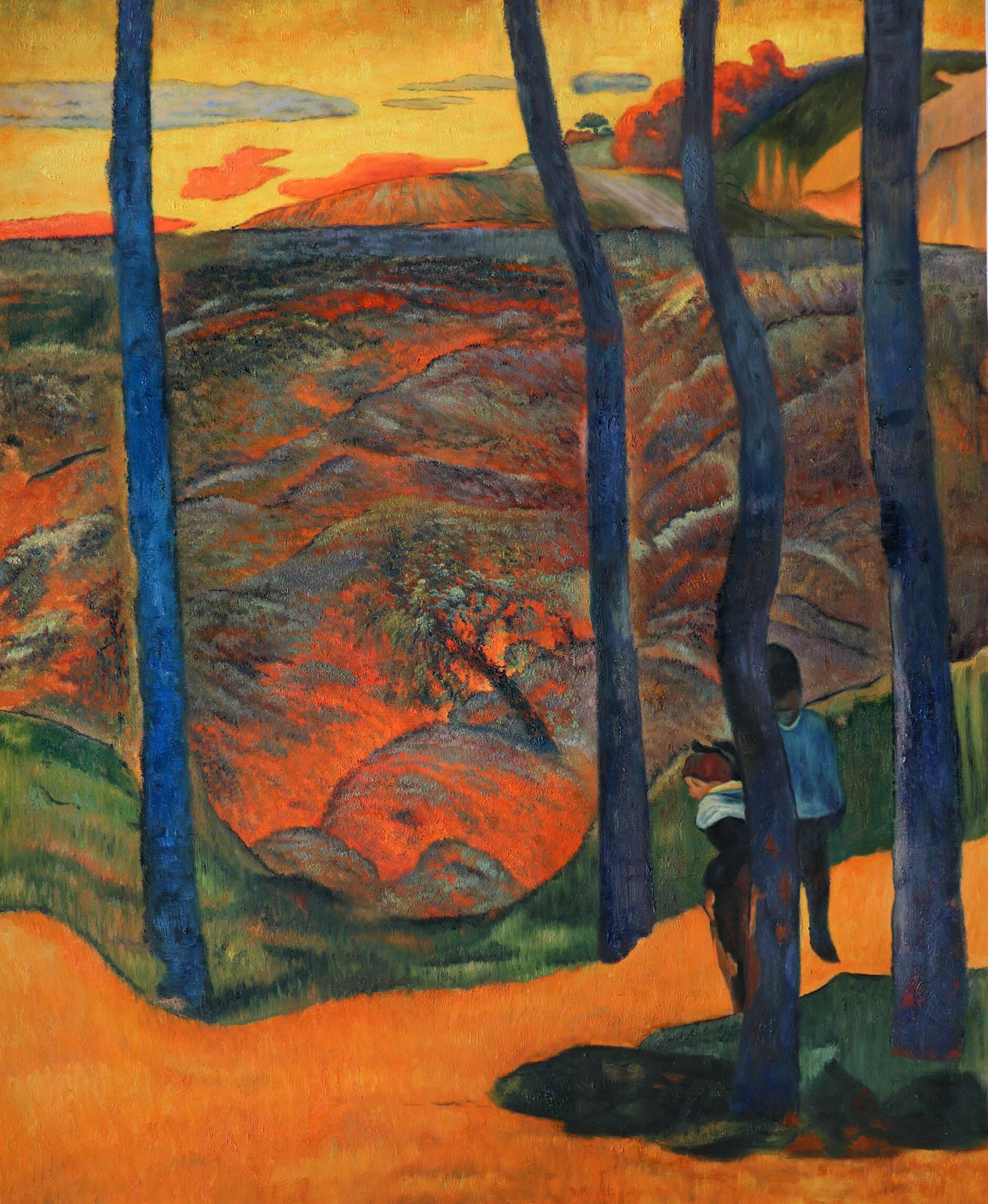
In the first part of our guide, we will talk about warm colors. Colors like red, orange or yellow have longer wavelengths, advance to the forefront of an image, have more visual weight and create a sensation of warmth, as opposed to the cool ones (blue, green or purple). They are colors of intense emotions and passionate feelings, romance and intimacy, joy and comfort, sunshine and fire. They excite, they move, and they command our attention.
This guide will help you learn about different symbolic meanings a color can represent in an image, most of which are universally recognized and accepted.
We will look at numerous examples in art, photography and cinematography, to better understand how colors work for various contexts and purposes. And finally, we will share some ideas on where to find inspiration and further study opportunities for every color, in real life and in works of artists.
The Musicians or Concert of Youths (c. 1595) by Michelangelo Merisi da Caravaggio
RED
Devilishly attractive, vibrant and powerful – red is one of the most beloved colors in the world and an elemental force to be reckoned with. It grabs hold of our attention instantly, and literally gets under our skin. Science people have in fact proven red’s ability to make our hearts beating faster, us – breathing harder and eating with greater appetite. The color of blood, red has a unique and intimate relationship with the human body, and we react to it so strongly partly thanks to our visceral familiarity with it.
The story of this captivating color has been playing out for thousands of years. Red ochre (which, if very simply put, is a mix of dirt and clay with a touch of rust) was readily available to our prehistoric ancestors, who used it enthusiastically, painting the walls of caves in attempts to artistically recreate the world around them.


For all these centuries, people have been seeing red as the color of blood and fire – both literally and symbolically. In our brief glance at the color’s symbolism below, you’ll notice how drastically vary some of its connotations from quite optimistic to absolutely horrifying. A lot of that can be explained by the essential duality of life and death, also present in the ideas of both blood and fire. The flow of blood in our veins and the warmth of fire are necessary for health and survival, while uncontrollable fire can cause destruction, and too much blood outside our bodies means injury or death.


Color of Sacrifice and Courage
In the Christian tradition, red was the color of blood shed by Christ and other martyrs for the sake of humankind. To honor this bloody sacrifice, during the Middle Ages, the Pope and the senior clergy of the Roman Catholic Church started wearing red robes; and artists started dressing Jesus, his mother Mary, martyrs and other central religious figures in red vestments in their paintings and icons.
Courage became as tightly associated with the color as it is with any act of sacrifice. This connotation is one of the reasons red is such a popular choice for elements of flags and heraldry.


In Japan, this powerful aspect of the color has been exploited to its full dramatic potential. In an impressive Japanese theater tradition called kabuki, actors perform and dance wearing elaborately designed costumes and brightly colored makeup-masks. The colors differ depending on the role played by the actor. Red is reserved for valiant heroes, liberally gifted with honor and courage, and bathed in the blood of their enemies. The symbolism has been taken over by other kinds of visual arts in Japan, with red comfortably settling in as the color of heroism.
The Bolshevik (1920) by Boris Kustodiev. A giant man waving a red flag shows us the massiveness of the Bolshevik Revolution.
Color of War and Revolution
There is no shortage of fire and bloodshed in the times of war and violence. Red is glowing with all the rage and aggression involved in such events. Ancient Romans understood that, and dressed Mars, their god of war, in red. Centuries later, the color’s rebellious spirit exploded in significance during the years of the French Revolution. The French government had tried to use a red flag to frighten the protesting crowds into dispersion, but failed. It all ended with a fight and the first victims of the Revolution. The Jacobins then inverted the meaning of the flag and took it as their own, to honor the blood shed by their fallen brethren. Red was also the color of the so-called “liberty caps”, worn by the revolutionaries and inspired by felt caps presented to slaves in Ancient Rome on the day of their liberation.


Ever since those tumultuous times, red has started popping up in the flags of every revolution imaginable, including the Russian Revolution of 1917 and the Chinese Revolution of 1949. Consequently, the color was adopted as a symbol of various left-wing political movements: from socialism and communism to anarchism. It has also become one of the most prominent elements of the associated artistic styles, such as social realism and constructivism.
2001: A Space Odyssey (1968) by Stanley Kubrick. When Bowman is in Hal's processor core, trying to disconnect Hal's circuits, the lighting turns red, creating the atmosphere of dread and hinting at the inescapable death.
Color of Danger
Highly visible and loaded with heavy symbolism, red has been used as a sign of warning for a very long time. In the Middle Ages, if you were a captain of a pirate ship, or a general on a field of battle, you could order to hoist a red flag, showing your enemies that you were going to fight to the death and slaughter them all without mercy.
Back then and now, red has been known to trigger the strongest reaction in people as compared to other colors. It makes us alert and ready to act quickly. Today, red is warning people of danger as a color of stop and high-voltage signs, traffic lights, sirens and fire engines.

The Sixth Sense (1999) by M. Night Shyamalan. Here, red is the color of objects tainted by the other world, warning us that something dangerous is about to happen.
In visual arts, this quality of red can be exploited to create an uneasy atmosphere, or to hint that something dangerous is about to happen.


Color of Evil
Let’s plunge even deeper into the red abyss! Hell is burning red and so is its boss, the Devil. Satan’s minions, imps, dragons, vampires: everything sinister, threatening and macabre in art is often splotched red in one way or another. No wonder it is so widely used in horror movies. A great example is Suspiria, a movie by the Italian director Dario Argento, which is a genuine tribute to color red. The film is brimful of other colors too, but red is almost omnipresent, either as a glow or a deluge, flooding the screen and overloading our senses, much like the Evil permeating the entire space of the nightmarish Dance Academy.
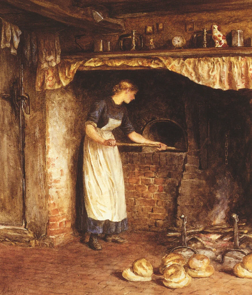
The Pale Complexion of True Love by Eleanor Fortescue-Brickdale (1898)
Color of Love
Hot, intense and captivating, red has everything one needs to be a herald of love in the world of colors. For centuries, it has been stirring up the feelings of passion, desire and sensuality through imagery, attire and design in all kinds of audiences. Hearts are symbolically pictured as red, and red roses are commonly associated with affection and courtship. Have a look at St. Valentine’s Day decorations, and risk getting suffocated by a heated embrace of red-colored merchandise. Red is rumored to make people wearing it feel more attractive and bold, thus fixing red clothes, lipstick or nails as a popular choice for those intending to impress, spark interest and create intrigue.
On the opposite end of the imaginary scale of “decency”, red is and have been frequently seen as a color of lust, seduction and sin. In the past, prostitutes were supposed to wear red to clearly signalize their line of occupation, and brothels often used red lights as distinctive features. After a while, pleasure districts had started to be restricted to certain neighborhoods, and those areas became known as red-light districts.

Color of Energy and Festivity
Red is bristling with energy and enthusiasm, charging us with motivation to go and take action. Marketing experts know this, and use the color zealously in designs for famous brands, sports teams, games, restaurants, and websites.
In visual arts, red is perfect for conveying festive spirit or fiery temperament. Henri Matisse’s works are radiating optimism and vitality, and he often used red to communicate the emotional intensity of his subjects. The red dancers in his painting La Danse are the very manifestation of joy, freedom and love of living. Another work of his, The Dessert: Harmony in Red, was initially commissioned as Harmony in Blue, but Matisse didn’t like the result and repainted it red, just because he liked it better.
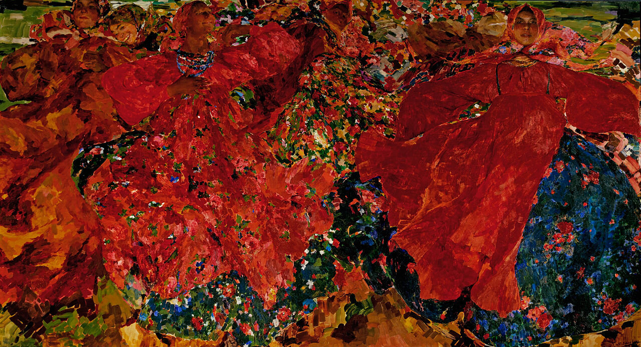
Filipp Malyavin and Boris Kustodiev loved using red to express the boisterous spirit of the Russian people. Their paintings seem almost alive with the vibrant scenes of peasant and merchant life, hearty feasts and folk festivals.
Apart from art, red is abundantly used in holiday decorations. For instance, you will see it everywhere during Christmas, St. Valentine’s Day, Mother’s Day or Chinese New Year.


Color of Power
Red is a confident and eye-catching color with a lot of visual weight and inner energy. This and the fact that red pigments were quite expensive at various periods of the color’s history, helped pave its way into the wardrobes and palettes of rich and powerful people. Its strength and impact was acknowledged all the way back in the ancient world, by leaders and generals of yore: ancient Egyptians and Mayans painted their faces red at important ceremonies, while Roman warriors and gladiators smeared their faces and bodies with the pigment to celebrate victories.
In the 16th century, Spanish conquistadors had discovered brilliant red dyes made by Aztecs from tiny cochineal bugs, that were collected from cacti and crushed into fine powder. Their introduction to Europe was a huge success, and cochineal came to be the third most valuable export from the New World at the time, following gold and silver. It became a symbol of wealth and high status and was in great demand among royalty and nobility.
Through the years, red’s position as the color of power, dominance and ambition has not wavered. A red tie, popular among politics and businessmen for its supposed ability to assert confidence, is called a “power tie”. Red carpets are still spread out at various important occasions and awards for celebrities to walk around and pose for photographs; and sportsmen wear red uniforms to attract victory. Red is as strong as ever.
SOURCES OF INSPIRATION
Red is a color we encounter frequently in the world around us. Here are some examples:
Some of the freshest and juiciest fruits and vegetables – tomatoes, bell peppers, chili, berries, apples, watermelons, pomegranates.
A whole array of brightly colored flowers – roses, tulips, poppies, poinsettia and so many others.
Traffic lights, car lights, interior lighting, and lighted signs, especially at nighttime.
Fashion and makeup.
Travel destinations: London with its red buses, post boxes and phone booths; Japan in autumn or anytime, for its red Shinto shrine gates called tori; salt lakes with red algae and sediment (e.g. Laguna Colorada in Bolivia or the toxic Lake Natron in Tanzania); the Panjin Red Beach in China with strikingly colored sea weed; Wisconsin Cranberry Highway, for marshes with flooded beds of cranberries during harvest time; or the Spanish town of Buñol in August, for a tomato fight at La Tomatina Festival.
Architectural sights, such as the Red Square in Moscow, Moulin Rouge in Paris, or the red fishermen’s huts along the coast of Norway.
Autumn leaves (this will do for orange and yellow as well) and autumn ash berries.
In art:
Many Renaissance artists were praised for the masterful use of red pigments in their paintings. Titian was renowned for his brilliant reds, particularly vermillion. By layering the pigments and mixing them with a semi-transparent glaze, he managed to make them look luminous.
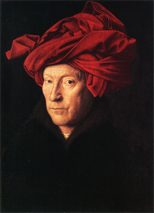
Another prominent example is Jan Van Eyck, who draped figures and interiors in his paintings in decadent crimson, as a sign of either their high social status or their sanctity.
Red was the favorite color of the Russian painter Karl Bryullov. When he wanted to make a compliment to a lady, he would use red as a background or a part of her wardrobe, to accentuate the beauty and the personality of his model. On the other hand, in his famous painting The Last Day of Pompeii, red is a sign of a disaster and is ominously spilled over the skies above the erupting Mount Vesuvius.
Constructivism was a movement that originated in Soviet Russia in 1915. Its founders believed art should serve the people and reflect the new, industrial world, instead of serving a decorative function – all in the name of the Communist revolution. The distinctive feature of the original Constructivism artworks and Constructivism-inspired modern graphics, is their predominantly red color.


In cinematography:
It’s impossible to talk about red color without mentioning Pedro Almodóvar. Red is perfect for accentuating the flesh and blood of his movies – themes of love and death, passion and danger.
The visual style of the Chinese director Zhang Yimou is particularly memorable for his stunning implementation of color. Red has an enormous presence in his works, taking on a complex variety of connotations, both traditional Chinese and Western. In his films, it can be a color of honor and courage, passion and revolutionary spirit.
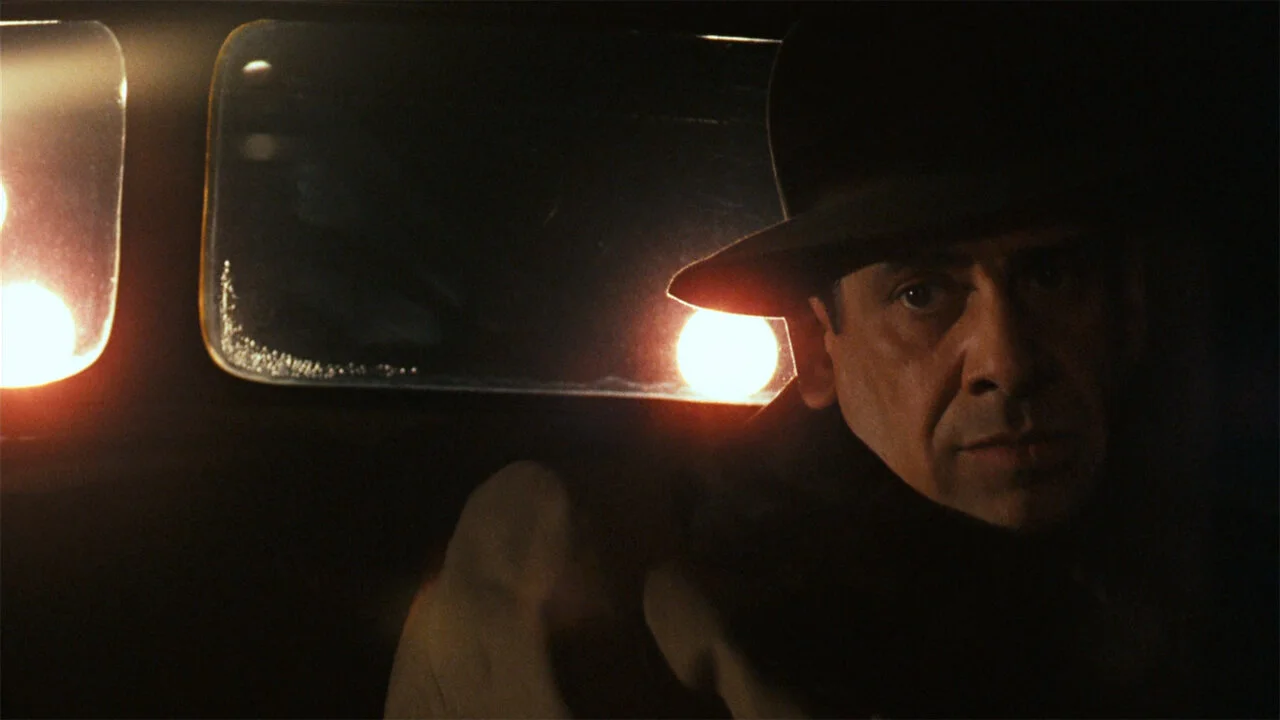
Another prominent fan of red is Martin Scorsese. He loves soaking the scenes of his movies in saturated, ominous red, especially those happening in bars or streets at night. His red is a visual signal for bad and dangerous things, such as violence, despair, obsession or lust.
One of the most exquisite and talented uses of red in cinematography can be found in Cries and Whispers by Ingmar Bergman. At that time, there was no color grading yet, just the meticulous set and costume design. Bergman’s red was intimately connected with the main topics of the film – illness, suffering, sexuality and the female womb. His personal association with red was the interior of the soul.


In photography:
There are many iconic photographers, who were excellent at shooting in color, with red being favored by quite a few of them for its ability to add drama and visual weight to a picture.
One of William Eggleston’s most famous and provocative images, The Red Ceiling (1973), exemplifies his passionate focus on color and together with other Eggleston’s prints, helped change the view on color photography as vulgar, prevalent among fine art photographers up to that moment of time.
Steve McCurry’s images show the colorful kaleidoscope of scenes from all around the world, with red featuring in many of them. Some of the most well-known red-colored shots were made during his trip to India.
Saul Leiter is another pioneer of color photography, famous for his beautiful, painterly images of New York streets and people. Often seen in lights, cars, signs and posters, as well as on people swarming through the streets of the big city, red is, unsurprisingly, a frequent visitor in his photographs.
Fred Herzog loved to walk the streets of Vancouver (and eventually, many other cities in almost 40 countries of the world) with his Leica camera, trying to capture the spirit of the cities and their daily life. He, too, paved the way for color in times when fine art photography was associated solely with black and white prints. You can see a ot of red accents in his works as well.
Stories from the Arabian Nights, Edmund Dulac, 1907
ORANGE
Orange is a warm glow of fire and the soft radiance of the sunset sky, the zesty freshness of citrus fruits and the hearty sweetness of pumpkins. A middle ground between red and yellow, it borrows the heat of one and the brightness of the other.
A profoundly positive color, it is however one of the most polarizing, with lots of people around the world either loving or hating it. Let’s have a look at some of its most common symbolic interpretations.


Color or Happiness and Enthusiasm
Frank Sinatra once called orange the “happiest color”. The warm and bright hue is indeed a symbol of cheerfulness and cordiality, friendliness and humor, entertainment and creativity. There is a reason clowns wear orange wigs (even though clowns are generally creepy). Dionysus, the Greek god of wine, festivity and ritual madness, is often depicted flaunting orange fabrics in classic images. A warm glow of a fireplace or campfire is what brings people together, to share stories and moments of unity. A first hint of color in the sky after a dark night, orange is also a symbol of a new day.


Color of Autumn and Harvest
There is possibly no other color as closely associated with autumn as orange. It is the color of changing leaves (along with red and yellow), pumpkins, carrots, caramel, marmalade, fire and jack-o-lanterns. All these associations make it a popular color among Hygge enthusiasts around the world. The season’s specifics bestow orange with the additional symbolism of harvest, change and fertility. The decorations for traditional autumn festivals, such as Halloween and Thanksgiving, are typically orange, too.
Still Life with Oranges by Rafael Romero Barros, 1863
Color of Nourishment and Flavor
The distinctive hue of many delicious fruits, vegetables and spices comes from photosynthetic pigments called carotenes. Named after its namesake fruit, orange is often seen as a color associated with a burst of flavors, healthy appetite, energy, freshness and fitness.


“Safety” Color
Orange is a highly visible color. In addition, it is complementary to blue and perfectly stands out against the sky, water and the blue shade of twilight. For this reason, orange (and in particular, a special shade called “safety orange”) is used for life jackets and rafts, buoys, traffic cones, high visibility clothing etc. Orange astronaut suits have the best visibility in space. Even the famous Golden Gate Bridge at the entrance of San Francisco Bay was painted orange to make it more visible in the fog.


Color of Heat, Desert and Exotic Landscapes
No color is better in conveying heat than the one that originates in volcanos. For centuries, minerals for orange pigments were found in volcanic fumaroles and hot springs. The so-called orpiment was rich in arsenic and highly toxic, which didn’t stop numerous alchemists from tinkering with it in hopeless attempts to create gold, or countless artists from using it to light up their paintings.
Hot desert landscapes have a lot of orange shades in them. Endless, desolate stretches of sandy dunes are not the kind of place many of us often find ourselves in, and sometimes remind us of what we think alien planets look like. These associations make orange a convenient tool for conjuring up exotic worlds and fantastic landscapes in visual arts. On a different note, it is also the color of a nuclear blast afterglow, which makes orange a common choice for creating dusty and rusty post-apocalyptic settings on prints, screens or canvases.
SOURCES OF INSPIRATION
Let’s have a look at the examples of orange color found in the natural and man-made world around us:
Sunsets and sunrises. Combine a sunset (or sunrise) with a desert setting, and you’ll get an explosion of oranginess.
Some of the prettiest animals have orange-tinted fur: think squirrels, foxes, tigers, orangutans, and the cutest of all – red pandas. Goldfish are lovely too, and are one of the most common aquarium fish in the world.
Saffron is an important color in Hinduism and Buddhism, and different shades of orange are commonly worn by monks and holy people in Asia.
Don’t forget about foods: mangoes, carrots, pumpkins – we have already mentioned a lot of them before.
Hot metal at metallurgical plants is magnificently orange, while abandoned factories offer a more subdued version of the color in the form of rust.
Fire, candle lights and lanterns. For thousands of lanterns floating up into the sky, check out the magical Yi Peng Festival in Chiang Mai, Thailand, usually taking place in November.
Travel destinations: the famous Antelope Canyon, located just outside of Page, Arizona; desert landscapes of all kinds, with notable examples including the Namib Sand Dunes in Namibia, Erg Chebbi in Morocco or the Atacama Desert in Chile; the massive Uluru Rock Formation in Australia; or another Namibian location called Deadvlei (or “dead marsh”), with remnants of trees popping out of a white salty surface, dramatically contrasting against the bright orange backdrop of dunes.
In art:
Pre-Raphaelite painters are known for their infatuation with redheads, inspired by their muses, who were modelling for them at that time. That’s the reason their art is full of numerous portrayals of women with flowing long hair in various shades of orange.
The color really came to life in the works of Impressionists. They had recently discovered the advantages of color theory, and oranges, in combination with azure blue, proved to be a substantial help in suffusing the scenes in their paintings with natural light.
Paul Gauguin, a Post-Impressionist, loved using oranges for his backgrounds, for clothing and skin color, which made his paintings look bright, warm and exotic.
A German-born American artist Albert Bierstadt was mostly well-known for his paintings of the American West. His romantic landscapes, warmly lit by the setting sun or campfire, have a lot of balmy oranges in them.
A whole gallery of gorgeous sunsets can be found in the paintings of other members of the Hudson River School (along with the previously mentioned Albert Bierstadt), such as Frederic Edwin Church and Sanford Robinson Gifford.


In cinematography:
Usually, orange shades are used to warm up a scene (sometimes in contrast to a cooler lighting), and make it feel snug and comfortable, like the candlelit scenes in the Great Hall of the Hogwarts School in the Harry Potter movies. However, in Damien Chazelle’s Whiplash, low key orange lighting, used when the main character is in the presence of his teacher, has a more sinister undertone of a fire that got out of control, hinting on the true persona of the infamous professor.
Speaking of candles, some of the most famous candlelit scenes can be found in Stanley Kubrick’s period drama Barry Lyndon, where these scenes were shot without any sources of electric light, which gave them a look of 18th-century paintings.
Mad Max: Fury Road by George Miller is a spectacular explosion of oranges that do a great job enhancing the hopeless, endless and chaotic feeling of the apocalypse setting of the film.
The brightest shades of orange in movies are found in fire scenes, which are masterfully shot by so many cinematographers. Some of the examples include mesmerizing scenes from There Will Be Blood by Paul Thomas Anderson, Macbeth by Justin Kurzel and Apocalypse Now by Francis Ford Coppola.


In photography:
Frans Lanting is a Natural Geographic Photographer, who captures incredible photographs of landscapes and wildlife. Many of his shots feature stunning, rich oranges, especially those taken during his many years of work on the African Continent.
Eliot Porter was an American photographer, known for his picturesque photographs of nature. Many of them were shot in the autumn, or in the canyons of the American west, which resulted in a plethora of orange-colored prints.
Though not exactly a subject to get inspired by, the apocalyptic potential of color orange is vividly demonstrated in photos of wildfires. Some of the best shots were made by the National Geographic photographer Mark Thiessen.
There is a technique called steel wool photography, for which you need a combination of some hardware and kitchen supplies, and a camera. People light the steel wool on fire in a whisker and spin it around. Thanks to the long exposure, flying sparks turn into burning, orange trails of light. The result is very creative, otherworldly specimens of photography.


YELLOW
Yellow was yet another color widely available to our prehistoric ancestors in the form of yellow ochre, and was one of the first colors used in art.
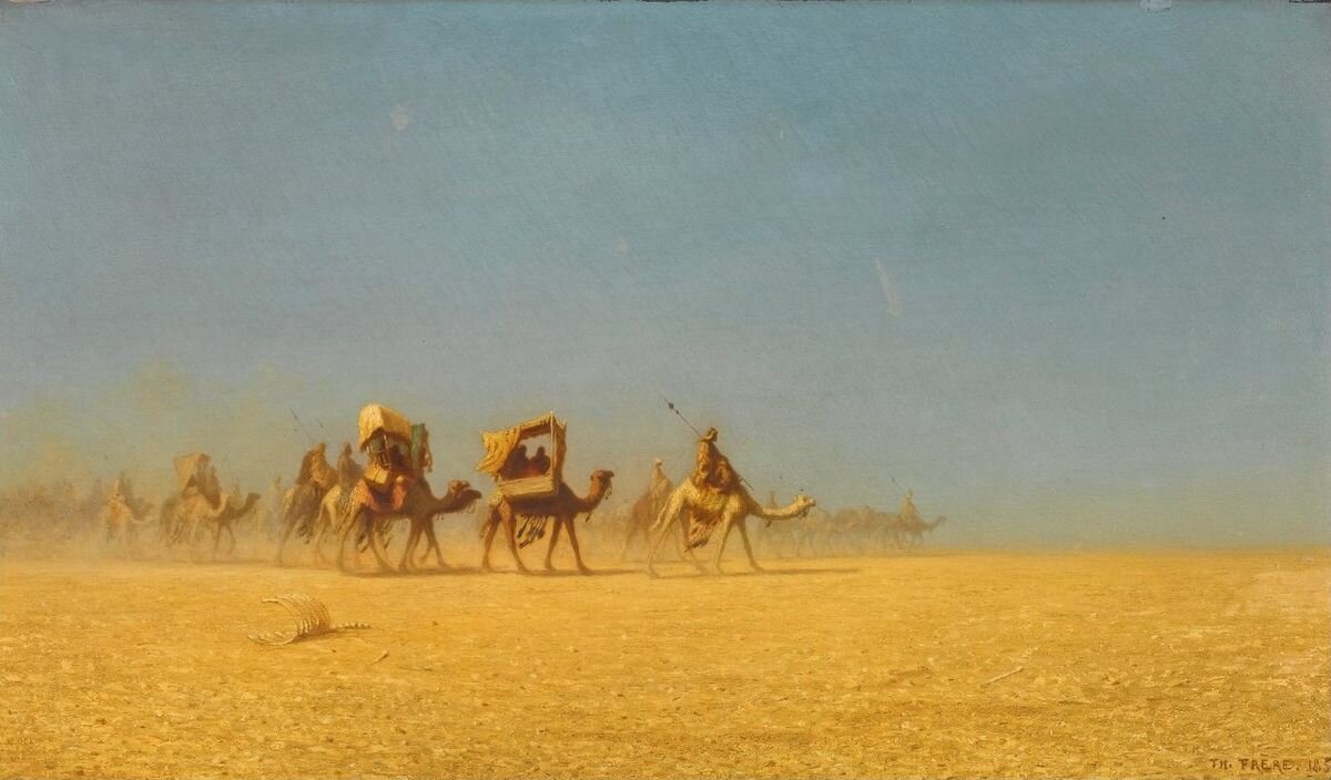
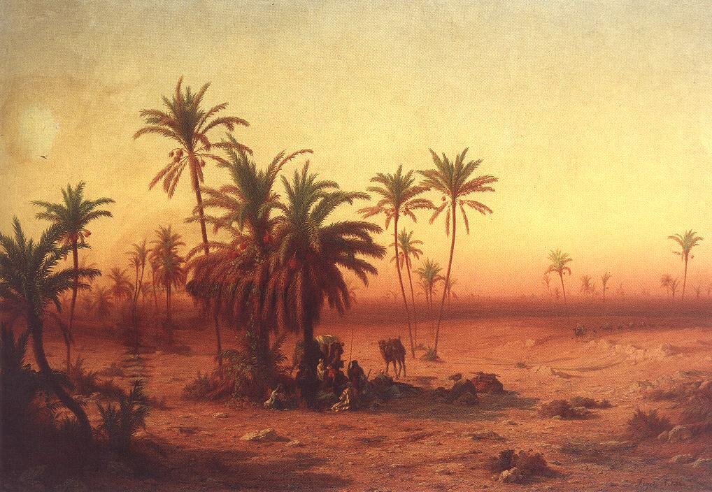
Camel Train in the Desert (1855) by Charles-Théodore Frère
Some of the yellow pigments have the most curious origin stories: the Naples yellow, that was made from rocks found in the area around Mount Vesuvius; the Chrome yellow, made of a shiny mineral discovered in the Ural Mountains; and the most unusual of them – Indian yellow, supposedly made of the dried urine of malnourished cows, exclusively fed with mango leaves.
Yellow reminds us of the shining sun and the glittering gold. But on the other hand, it smells of decay and sickness. Making our way through the color’s connotations, we will see how yellow has become the very manifestation of ambiguity in visual arts.
The sunlit scenery in Among the Sierra Nevada, California (1868) by Albert Bierstadt
Color of Light
The color of midday sun, yellow has absorbed all the qualities of this radiant ball in the sky. It is so bright it’s tiring to our eyes if used without moderation. Warmth, energy, summertime are the connotations that follow naturally along.

Color of Joy
The previous point is where the shining positivity of color yellow stems from. Amusement, excitement, pleasure, joy – yellow has the privilege of expressing all the nicest things in the world.
When we reminisce of our childhood, the memories often turn up colored with splashes and twinkles of this sunny color, enriching it with connotations of innocence, naiveté and playfulness. Imagine immersing the scene you’re creating in yellow lighting, with speckles of dust floating in the rays of sun, and you will get yourself a nostalgic journey through time if you want one.
This bad guy in Sin City (2005) by Frank Miller and Robert Rodriguez is known as The Yellow Bastard, and his toxic color rather explicitly represents his dangerous nature.
Color of Caution
Yellow is yet another color used extensively in signage to draw people’s attention thanks to its high visibility and brightness. Even snakes and insects sometimes wear it to warn other creatures of their venomous skills. In the human realm though, it is used to mark things intended to be noticed from afar, such as road signs and emergency vehicles, school buses and taxi cabs. Less intense than red, yellow is mostly meant to signify caution rather than danger.
The Night Café (1888) by Vincent van Gogh. In his own words: "In my picture of the "Night Café" I have tried to express the idea that the café is a place where one can ruin oneself, go mad or commit a crime. So I have tried to express, as it were, the powers of darkness in a low public house, by soft Louis XV green and malachite, contrasting with yellow-green and harsh blue-greens, and all this in an atmosphere like a devil's furnace, of pale sulphur".
Color of Sickness and Madness
When getting old, many things tend to become yellow and brittle. Leaves of trees change color in the autumn before they completely dry out and fall, old paper turns yellow and crumbles with time. People suffering from liver dysfunctions develop jaundice, which is the yellowing of the skin and whites of the eyes. The color itself was practically doomed to pick up the off-putting association with aging, decay and sickness. And not just physical sickness, mental too. In Russia, there is a colloquial expression for an asylum as a “yellow house”, because it’s the color they used to be painted in. Without any scientific justification, yellow seems to be creeping around people of various mental extremes. For example, Van Gogh’s paintings grew more and more yellow as he turned more and more unstable towards the end of his life.
The atmosphere of sickness, uneasiness and insecurity is easiest to achieve using dimmer, “dirtier” shades of yellow instead of purer, brighter ones. It is best to avoid them, if the negative connotation is not what you are looking for.

Color of Dryness and Heat
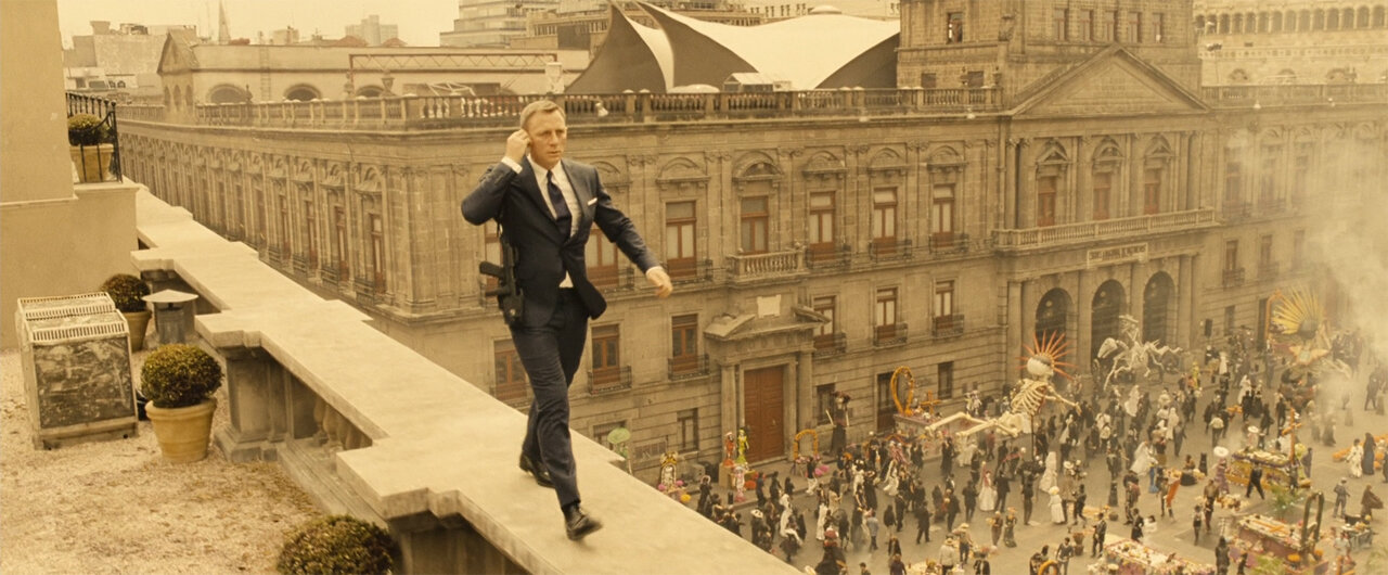
Along with orange, yellow is a color of arid and sandy desert landscapes. On a hot day, under the scorching sun, with the world around you melting, the air itself seems yellow and suffocating. When cinematographers picked that up, yellow filters have become extremely popular (to a degree they seem to be abused) for depicting countries associated with hot climate, such as India or Mexico, and other countries of South America, Middle East and South East Asia.
Portrait of Adele Bloch-Bauer I (1907) by Gustav Klimt
A Special Mention to Gold
Many people think of golden as a shade of yellow, but it’s not that simple. There is a shade called gold, but in reality, it is just a simulation of the color of the actual metal. Metallic gold has a shine, which cannot be reproduced on screen as a solid color.
The metal has been used in art by way of smashing golden plates into very thin sheets that are called gold leaf. First things that come to mind as an example are Byzantine mosaics and icons. The gold in them symbolizes the Divine Light and the eternal world of God. Artists used it to illuminate backgrounds, halos and clothing, making them subtly shine when looked at by candlelight.
Another famous example is Gustav Klimt, who was deeply impressed by Byzantine mosaics during his trip to Italy. He was very well acquainted with gold since childhood, because his father was a gold engraver. He decided to incorporate gold leaf into his paintings, and that has marked the beginning of his Golden Phase – a series of glimmering artworks that made him famous.
SOURCES OF INSPIRATION
Yellow is frequently seen in nature and adds so many bright accents to our lives:
Birds and other wildlife: canaries, parrots, ducklings, butterflies, bees.
Numerous specimens of flowers – daffodils, sunflowers, buttercups, dandelions, rapeseed – and their pollen.
Some of the most flavorful foods and spices: lemons, bananas, honey, oil, pineapples, turmeric.
Yellow vastness of sand beaches and dunes.
Street lighting at night, as well as interior lighting.
Yellow raincoats on people are an extremely popular tool in landscape photography.
Yellow buses, vans, taxis, trams. In Berlin, even the subway trains are yellow.
Travel destinations: golden fields of canola flowers across the Luoping County in Southern China or in Victoria, Australia; sunflower fields in Rai Meneesorn, Thailand or Tuscany, Italy; Colorado in autumn, with its vibrant Quaking aspen trees; or a famous avenue of ginkgo trees, in Asan, South Korea, also in autumn.
Architectural highlights: the dazzling yellow Shwedagon Pagoda in Yangon, Myanmar; the whole town of Izamal in Mexico; and Vietnam’s own “Yellow City”, Hoi An.
In art:
The British Romantic painter J. M. W. Turner is well-known for his passionate love of yellow. His sunlit seascapes and lucent landscapes were often criticized by his contemporaries for the excessive use of the color. They laughed and said he had yellow fever, and his works were “afflicted with jaundice”. Today, he is considered by our contemporaries the Master of Light.
Art historians have different explanations for Vincent Van Gogh’s obvious obsession with yellow. Among them are his vision problems, the abuse of absinth and the lead poisoning. Or maybe, he just really loved the color of sunshine, sunflowers and his “buttery yellow” house in Arles. All we have left, is his legacy of vivid paintings, predominantly colored with his favorite color.
Rembrandt, the master of light and shade, mostly used yellow pigments to paint the warm lighted areas in his paintings. Most of the time, the color brings out something very significant in the image, for example Hebrew words appearing at the Belshazzar’s Feast, as if written by a divine hand.
John Atkinson Grimshaw, an English Victorian-era artist, was best known for his moonlit or gas-lit nighttime cityscapes. Of course, he painted a lot of morning and daytime scenes as well, and most of his paintings, including the already mentioned nocturnal ones, are suffused with dim ethereal yellow lighting.
The German artist Wolfgang Laib is well-known for his installations made out of pollen, which he collected from flowers and plants and then scattered on the floor to create rectangles, or other shapes piled in small mountains or put into glass jars.


In cinematography:
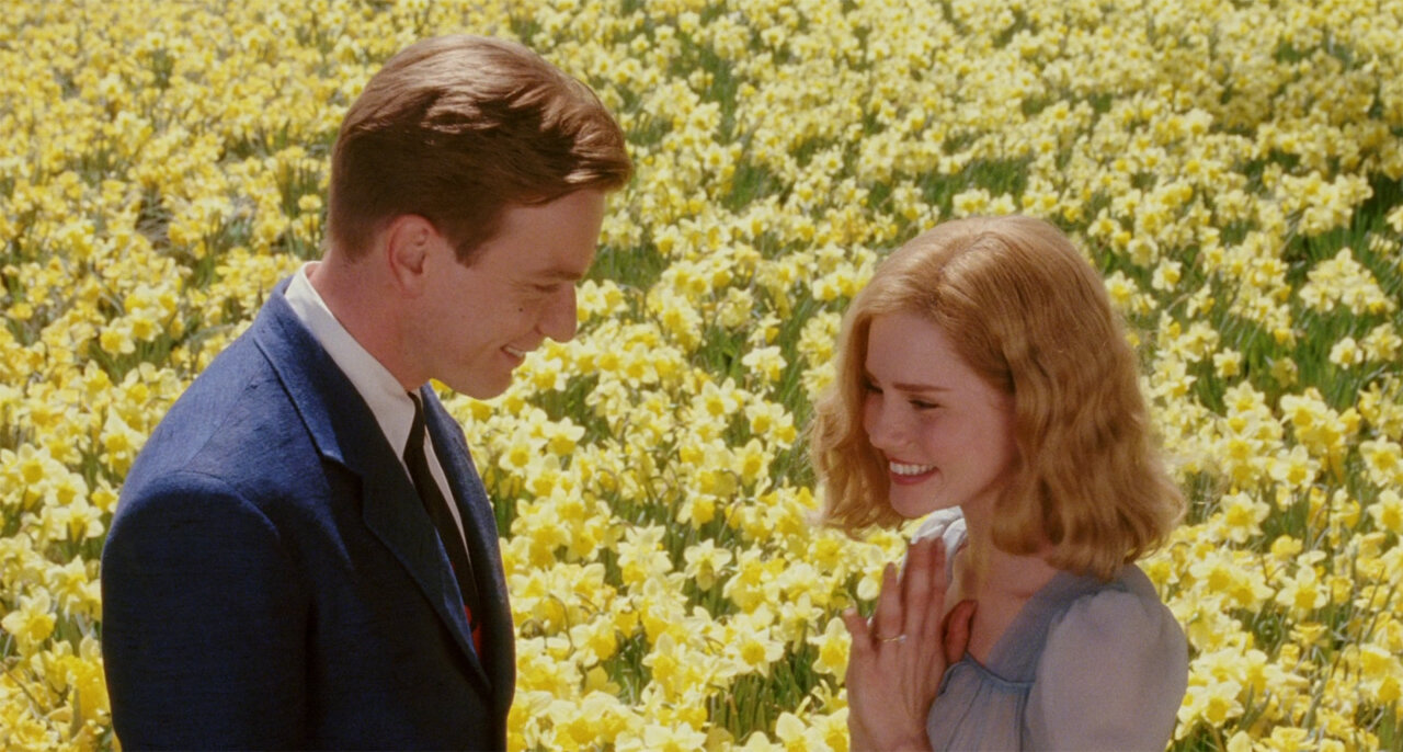
Wes Anderson is well-known for his masterful implementation of colors, with yellow being one of the most used. Most of the time, the symbolism of the color is pretty straightforward: yellow implies happiness, optimism, innocence and youth. Both of the latter connotations are especially evident in the Moonrise Kingdom, a film about childhood and young love, and The Life Aquatic with Steve Zissou, with its yellow submarine, which is the only thing that makes the protagonist happy.
Yellow is another warm color often paired with cooler tones for the sake of color contrast. In Guillermo del Toro’s Pan’s Labyrinth, the colors are used to differentiate between two worlds, with the real one being cold and blue, and the “fairytale” world being warm and yellow. However, warm tones don’t always mean nice and cozy. One of David Fincher’s favorite colors, yellow easily turns dirty, sickly and stifling in his rather dark-themed movies.
In Ari Aster’s Midsommer, the chilling events are unfolding in the bright daylight, as opposed to the usual dark, cold and creepy horror settings. The summer is at its peak, the sun is shining, and the ever-present yellow color is a symbol of death.


In photography:
Yellow is the color of lamps illuminating our homes and streets at nighttime. The photographer Gregory Crewdson’s cinematic and surreal shots are often taken at night, with yellow light of the lamps confronting the cold and uneasy surrounding darkness.
Warm lighting and bright yellow accents are common companions of color photographers. Even though none of them are (or were) using the color exclusively, some of the best shots were made featuring this vibrant hue. For some great examples, check out the Mumbai series of the Indian photographer Raghu Rai, American Color or Havana projects of the Greek-American photographer Constantine Manos, Spain & Portugal and Brazil series of the Moroccan-born French photographer Bruno Barbey, or many of the New York photos of our favorite Saul Leiter.
The French photographer Pierre-Louis Ferrer uses an unusual infrared photography technique. One of his projects, named Golden Périgord, is a series of brilliant yellow landscapes of Dordogne, France.


PINK
Romantic, charming and delicate, pink virtually smells of flowers and cotton candy. Its English name was derived from the name of a flower, member of the genus Dianthus.
In some other languages, pink was named after a rose. It is no wonder then, that the array of connotations the color pink is carrying includes the lightest and the fluffiest of ideas. Which should in turn make it a color loved by everybody. Right? Wrong.

Cattleya Orchid, Two Hummingbirds and a Beetle (c.1875-1890) by Martin Johnson Heade
In fact, pink is one of the least favorite color among people, and one of the most politically tainted and divisive.
First, though pink is considered a color, it is actually a whiter tint of red. It is said that pink has absorbed the heated nature of red and the pure nature of white. At times, it can be innocent, at other times – teasing. Second, it is the color influenced the most by marketing and politics. For reasons long lost in the obscure lanes and alleys of mass culture, pink has been stuck as a “girly” color for half a century and has managed to ruffle the feathers of many people, in one way or another.


Color of Sweetness and Gentleness
Imagine cotton candy. Strawberry ice-cream. Bubble gum, lollypops, pastries – the list can go on and on. A numerous amount of sweet things is naturally or artificially colored pink, firmly securing the corresponding association with the color. When we talk of sweetness figuratively, we usually mean gentleness, kindness and softness of character or manner. So can be pink – approachable, not threatening in the least, delicate and calming.


Color of Innocence and Youth
As far back as the Middle Ages pink could be seen in art in the depiction of the garments of infant Crist, as well as heavens and its holy inhabitants. Babies and children of richer families have been dressed in delicate pink for years. The color of toys, candies and frills, pink is the manifestation of innocence and childhood, as well as their less pleasant relatives – immaturity and infantilism.


Color of Romance and Seduction
The pink color really blossomed in Europe in the 18th century, in a perfect setting conjured up by the lush and playful Rococo style. Taking over from bright colors of the past century, pastel colors, no least of them pink, had become extremely trendy among both men and women, in fashion and interior design.
Madame de Pompadour, the famous mistress of King Louis XV of France, loved pink tenderly, wore it often in combination with blue, and even commissioned the famous Sevres porcelain factory to develop a special tint of pink, which was called Rose Pompadour. The paintings of artists Jean-Honoré Fragonard, Thomas Gainsborough, François Boucher and their contemporaries were filled with playful frolicking, whispers of blushing lovers in the woods, rosy nudes and silky gowns of high-profile mistresses. Long gone was the angelic innocence of pink from the Middle Ages. This new pink was coquettish, teasing and sensual.


Color of Femininity
The aggressive feminization of color pink is in fact a rather recent development. Up until around 1930s pink had either been gender neutral, or even preferred for boys as a stronger color, a lighter version of masculine red for children; whereas the more delicate blue was favored for girls. Since the 30s, everything got turned upside down. In 1937, the Italian fashion designer Elsa Schiaparelli created a new, bold version of pink by mixing magenta with a small amount of white. It was so bold it was named “shocking pink” and used in the design of a perfume, sold in a bottle in the shape of a woman’s torso. She also popularized the new pinks in her fashion designs, created in collaboration with the surrealist artists, including Jean Cocteau.
When the 50s exploded with bright colors, so readily welcomed by people after the horrors of the World War II, pink managed to position itself strongly among the most popular. The color was favored by many female icons of the time, and its symbolism started to accumulate ideas embodied and promoted by those women – femininity, softness, sensuality. Most of them did not mind coming back to their traditional roles after their husbands and sons had returned from the war. Pink became a popular choice for kitchens, bathrooms, clothes, makeup, and even automobiles. Little by little, it found a firm footing as a “girly” color, dragging along a string of stereotypes associated with women – fragility, infantilism, and obligatory cuteness. Eventually, the presence of pink in the childhoods and daily lives of women had become overwhelming, to a degree of being suffocating to many of them. It was to be expected, that sooner or later women would start protesting against this mostly ungrounded generalization of preferences and characters, which they did and some of them still do.
In the latest years though, pink has started to recover its gender neutrality. An example of this process is the popularity of a dusty, subtle shade called Millenial Pink, ubiquitously used in the 2010s for décor, clothing, furniture and product design. That may very well be a sign of a new chapter in the complex story of the color pink.
SOURCES OF INSPIRATION
Even though the first thing that comes to mind in association with pink is flowers, there are a number of other ideas where to find it in the world around us:
Blooming trees, especially cherry blossoms.
Rose colored living creatures, such as flamingos, salmon, the cutest Amazon river dolphins and pygmy seahorses, or the fascinating female orchid praying mantis.
Gemstones and minerals: rubies, Himalayan salt or pink sandstone.
Travel destinations: Lake Hillier in Australia or Lake Retba in Senegal, strikingly pink due to their high salinity and a special type of bacteria; architectural marvels made of pink sandstone, such as the Al-Khazneh temple in Petra, Jordan, or the Leshan Giant Buddha in China; or the fluffiest pink sand beaches in Barbuda and the Bahamas.
Entire cities like Marrakesh in Morocco, or Jaipur in India.
Pink sunsets and sunrises.
Pink neon lights.
Pastry, candies, ice-cream and other dwellers in the World of Sweets.
In art:
The previously mentioned Rococo artists are definitely worth exploring in search of pink inspiration. The soft rustle of rosy gowns, fragrant petals and delicate carnations can be found in the paintings of Jean-Antoine Watteau, Jean-Honoré Fragonard, Thomas Gainsborough, Francis Hayman or François Boucher.
While you are at it, do look up Sèvres porcelain of a special Rose Pompadour shade, invented for Madame de Pompadour by the famous porcelain factory due to her love of pink and her great support of their trade.
In the 20th century, pink appeared within the Pop Art movement with renewed energy. Andy Warhol used it for his portraits (the most famous of which is the one depicting Marilyn Monroe), self-portraits, flowers, cows, cats and numerous other subjects. Another fun example is the British painter David Hockney and his colorful paintings of landscapes, people and swimming pools with frequent splashes of pink.
In 1904-1906, Pablo Picasso went through the so-called Rose Period in his art, brought about by the increase in joy and romance in his life. In those years, his paintings started to feature mostly warm pink and orange tones, in contrast to the cooler, sadder tones of the previous Blue Period. Whereas earlier, his paintings were reflecting poverty and despair, the Rose Period represented much more cheerful subjects – clowns, harlequins, and carnival performers among them.
La Naissance de Vénus, 1753-1755 by Jean Honoré Fragonard
In cinematography:
Another mention of a Wes Anderson’s movie is unavoidable, due to the well-deserved popularity of his deliciously colorful visual masterpiece, The Grand Budapest Hotel. The scenes set in the hotel and the Mendl’s bakery in the 30s are suffused with gentle pastel pinks boosting the atmosphere of happier, healthier days, the charm and sweetness of Mendl’s pastries, and its baker Agatha’s purity and innocence.
Going back in time, it would be fitting to glance back at the films and icons, who were there at the dawn of pink’s feminization, popularizing it just by wearing it. The unforgettable Marilyn Monroe wore it in real life and on screen, while singing “diamonds are a girl's best friend” in the 1949 movie Gentlemen Prefer Blondes. Grace Kelly made the color look elegant and calm, playing a classical Hitchcock blonde in his movie To Catch a Thief. The dreamy, legendary Audrey Hepburn made the color shine in many films, including Breakfast at Tiffany’s and My Fair Lady.
David Lynch has played with pink quite a bit in many of his mysterious films. He exploited the gender stereotypes of the color in The Blue Velvet and Mulholland Drive, adding it to the wardrobes of their respective characters, Sandy and Betty, to reflect their innocence and immaturity. He marked the dream sequences of Mulholland Drive with fluorescent pink elements, that fit so well to the irreality of what is happening onscreen. In Twin Peaks, pink is again feminine and eerie, illuminating the corridors and bathrooms of the local high school and popping up in the outfits of female characters.
Sofia Coppola’s fondness for pastel hues, soft lightning and colors, representing the emotional states of her characters, results in a distinct visual aesthetic of her films. Pink tones are almost ever-present in her works, the most obvious examples being Marie Antoinette, Somewhere and The Beguiled.


In photography:
Some photographers like to experiment with infrared registering films, filters and conversions, creating surreal photography where “normal” hues are replaced with vivid pinks and reds. For examples, check the works of Kate Ballis, Zoe Sim or Richard Mosse.
The Belgio-Portuguese photographer Xavier Portela has created a collection of photos named Glow, which is a series of night scenes, captured in Tokyo and Hong Kong, illuminated with pink and purple signs and lights in all their mind-blowing neon glory.
The French photographer Andria Darius Pancrazi creates dreamlike architecture photography in soft pink shades. He mentions David Lynch as one of his influences and describes his style as “softserve pinkcore mulhollandwave”.


BROWN
Even though according to surveys, brown is one of the least favorite colors among the responders, it would be a mistake to simply brush it off.
The color of earth, wood and stone, there is strength and reliability in it, and it has been gaining a respectable level of popularity during the recent years, together with a trend for simple and natural way of living.

Dark shades of brown in the clothes and belongings of the banished Puritan family, as well as the woods around them, perfectly match with their poor and bleak existence in the middle of nowhere. The Witch: A New England Folktale (2015) by Robert Eggers.
The brown earth pigment called umber was one of the earliest and most available to the prehistoric artists, who only needed to smudge some soil on cave walls to paint a suitably accurate image of animals around them. Paintings of brown horses and other beasts found on the walls of the Lascaux cave are about 17,300 years old.


Color of Poverty
The story of brown as the color of the poor and the downtrodden is a long one. The color of mud, it was also a color that could easily hide dirtiness. In Ancient Rome, brown was reserved for barbarians and lower classes. The city’s plebeians were called "pullati", which could be literally translated as "those dressed in brown". There was a time in the Middle Ages, when poor people were required to wear russet – a coarse brown cloth made of wool. Franciscan monks dressed in brown robes to demonstrate their poverty and humility. It would take ages before brown would be able to shake off the reputation of a dull and shabby color and regain a more dignified position.


Color of Nature and Simplicity
There has been a surge in popularity of everything natural in the recent years. What was plain and dull before, became charmingly rustic and wholesome now. Shabbiness became chic. These days everyone knows, that brown bread and brown sugar are healthier for you than white. Together with green, brown is associated in design and daily life with the concepts of eco-friendly living, recycling and outdoors. People have finally realized that earth (and brown by association) is not just dirt, but a symbol of nurture, growth and fertility.


Color of Comfort
Brown can be surprisingly cozy. It is a color of chocolate and coffee. Warm blankets and furry animals. A lot of people associate brown with baking. Brown is restful to look at and essential for creating a snug and warm atmosphere at home.


Color of Nostalgia
Warm, brown and, more specifically, sepia tones in photography or cinematography always bring us back in time. The actual sepia pigment is in fact one of the oldest and was made of cuttlefish ink. Long ago, it was used by Ancient Greeks and Romans for writing. A while later, Leonardo da Vinci created numerous designs and drawings with the help of the same pigment.
More years later, in the 1880s, photographers introduced sepia toning, which was originally used as a special treatment of black-and-white prints, to slow down their aging. Many older movies were sepia-toned as well. As a result, we have inherited a treasure trove of old photographs and films with this warm toning, which only strengthened the connection of brown shades with nostalgia and history.
SOURCES OF INSPIRATION
Brown is always around us, even when we don’t pay attention.
It’s in the wood of trees and houses. Some of the most interesting examples of brown-colored architecture are wooden churches, still preserved in Norway or Russia.
It’s under our feet as soil or just dirt.
A large number of mammals and predatory birds are brown in color: bears, hares, deer, horses, owls, hawks and so many others.
It is the color of delicious things like cacao, chocolate and brownies, coffee and black tea, chestnuts and mushrooms, cinnamon and nutmeg.
Brown sand reminding people of chocolate can be found on the Rockaway Beach, located a few miles away from San Francisco, in southern Pacifica, California.
In art:
Starting from the end of the 16th century, brown was a color used by artists like Caravaggio and Rembrandt to create the chiaroscuro effect, which is based on a strong contrast between light and dark in a painting. Subjects steeped in rich brown shadows appear out of darkness, brightly lit by a warm light. Rembrandt used a new brown pigment, that was called Cassel (or Cologne) earth and was literally composed by ninety percent of soil and peat.
Grisaille is a painting technique executed entirely in the shades of one neutral color – gray, brown or green. Over the years, the technique has been used for different purposes: as imitation of stonework in the interior décor, as underpainting for oil paintings, and quite often, for its own sake as an independent art technique. Such monochrome paintings can be found among the works of Jan van Eyck, Hieronymus Bosch, Pieter Bruegel and many others.
Tonalism was an artistic movement that emerged in the 1880s in the US. It was characterized by misty, atmospheric landscapes, rich earth tones and muted color palettes. Some of its most prominent representatives were American artists George Inness, James McNeill Whistler and Albert Pinkham Ryder.


In cinematography and photography:
Watching old sepia-toned movies or photographs can be both fun and informative. That is where you’ll find the purest and subtlest shades of brown. Old photographs are easier to find than old films, but some of the more modern movies use sepia toning or faded brown palettes as well, in order to create an appearance of events taking place in the past.
One of the most original sepia stylizations in both cinematography and photography is Ashes and Snow, a travelling installation of photographic artworks, films, and a novel in letters created by the Canadian artist Gregory Colbert. Both the films and the photographs depict the connection and interactions between humans and animals in a poetic and sensual way.
Cinematographers often draw inspiration from art. Movies with low-key high contrast lighting recreate the previously mentioned artistic chiaroscuro effect onscreen. With warm light sources, shadows assume a deep brown tone. Such movies always project a certain “noir” vibe, albeit in color. One of the greatest examples is Francis Ford Coppola’s magnum opus, The Godfather. There is a reason his cinematographer Gordon Willis is called the “Prince of Darkness”.
Landscape photography is full of brown shades, simply because they are so common in nature. Especially, if the landscapes include large areas of barren ground or woods, and are shot in autumn or winter. Some photographers like producing darker, moodier landscape scenes with lots of earthy tones. Some of the notable examples among modern photographers are Edward Burtynsky, Valda Bailey and Mark Littlejohn.


Brown is the last stop of our exciting journey through the sunny lands of warm colors.
The study of colors is an endless process, especially considering how their connotations vary in different cultural contexts and even more so, in the eyes of artists creating their own unique images and worlds.
As always, we encourage you to explore, experiment and discover new things. And in the meantime, we are going to work on the next part of our guide – about cool and neutral colors.
Anna Udalova
ABOUT THE AUTHOR
After graduating in Linguistics, Anna Udalova’s longtime interest in the text-based storytelling has spread to its visual counterpart in the form of photography, cinematography and fine art. As an avid photography enthusiast, she has a special place in her heart for nature, travel and fluffy animals.